|
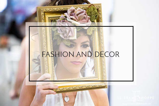
As new trends hit the runway, glimpses of fashion’s most desirable colors and styles are often seen mimicked in décor. Inspired by Pantone’s Fall/Winter fashion report for 2018, we wanted to show you our versions of the season’s inspiring palette to see how custom framing can keep you trendy.
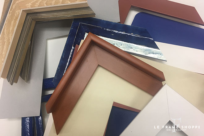
Pantone predicted 10 top colours for the fall. Variations can all be found in the gorgeous mouldings available today, but we wanted to focus on the 5 predicted classics that trends are built on.
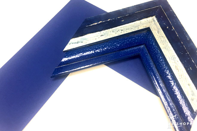
This blue can add a dramatic flare to your framing design.
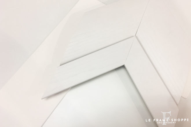
Clean white is ever more popular in today’s styles and can compliment so many wonderful pairings.
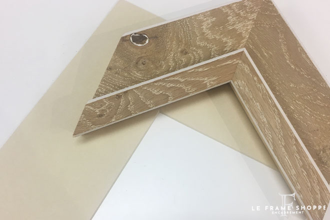
This gorgeous colour is so warm and inviting.
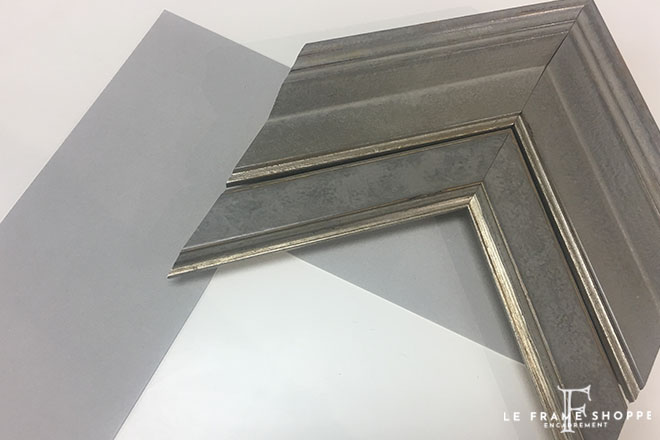
Timeless grey. Yes please.
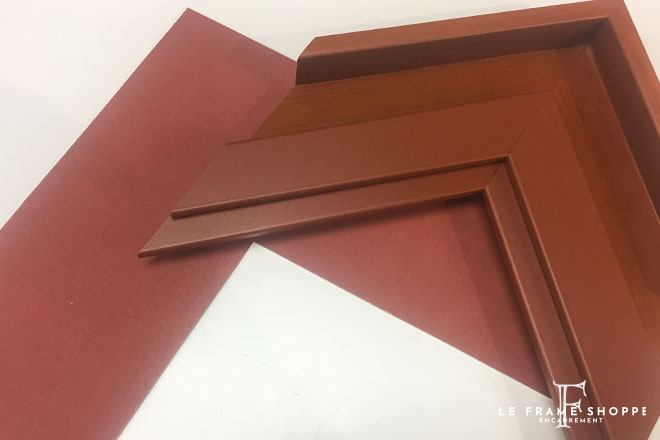
This perfect rust color adds a layer of richness.
Now that we have our cores, what can we do with them? There are endless ways to use this palette depending on your art, style and purpose. These colours can ground a design when added to cutting edge elements or to textures and colours that speak to you outside of what’s current. So go ahead and experiment! These colours work well even when mixed and matched together!
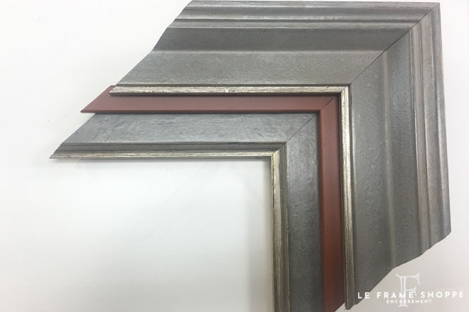
We are drooling over the many jaw-dropping combos that can be created using grey and rust. The rust adds just the right amount of warmth to the calm grey.
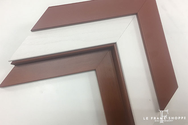
Loving the rust? Use this colour as the primary and pair it with white for a stunning contrast.
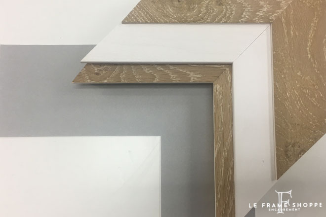
This camel tone looks beautiful paired with either white or grey or both
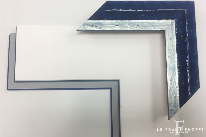
If you rather use punches of the deep blue in your home, this blue white and grey combo is a must.
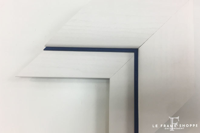
Another option is to keep the look simple without loosing impact. Try just a sliver of the blue against a chunky white moulding and mat.
These are just a few of the many moulding and mat combos that are worthy of any fashion magazine. What’s your favourite look?
0 Comments
Leave a Reply. |

