|
Pantone symbolically chose greenery, a vibrant shade representing “new beginnings” for this year’s color choice. This energetic color can liven up any space and we’re showing you how to incorporate it into your next project with our top frame designs.
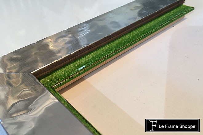
If you’re feeling the 2017 color pick but want to add a subtle touch to your design then opt for using greenery as an accent on the inside of a frame. We chose a metallic frame in this design to create a lot of impact, while keeping the greenery shade at a minimum.
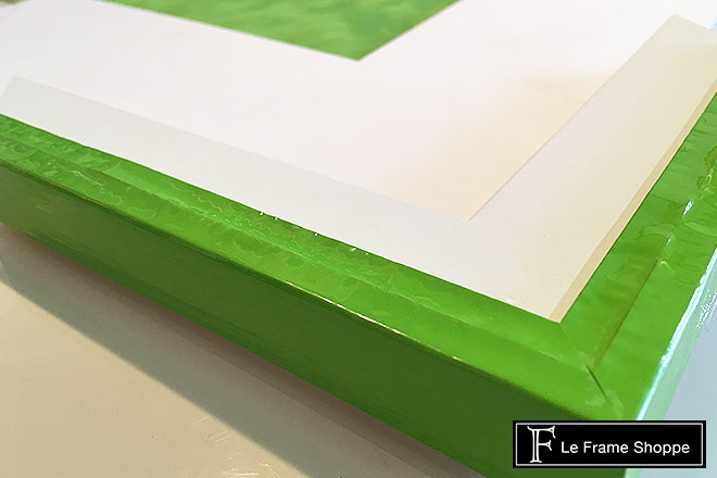
For a more prominent use of the colour this design shows greenery as a cap on the outside of a white frame. We love the contrast between the white and greenery followed by a matching mat to really add some zest to your décor!
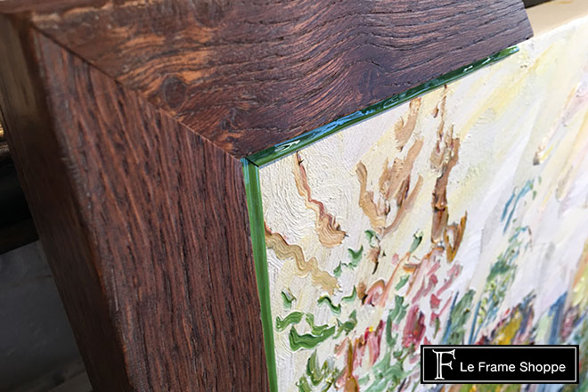
The Pantone pick is a seamless addition to a painting with earth tones and a yellow-green accent palette. We opted for a rustic wood frame to tie it all together.
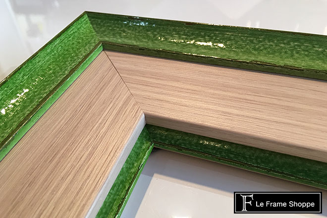
Using greenery to add vibrancy to a white oak frame is unexpected but oh so fabulous!
There are countless ways to add Pantone’s 2017 color to your next design so feel the energy add and some greenery to your space!
YOU MIGHT
|

